|
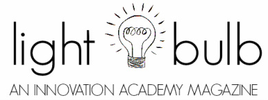
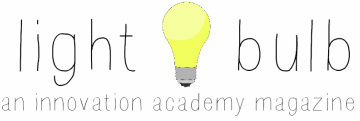
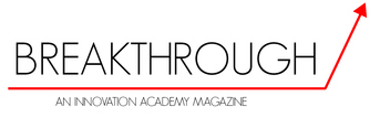
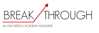
My task for the class-wide project is to lead a group of peer designers to form the visual identity of the breakthrough magazine. My first task: The logo. This job consisted of naming the brand and creating a visual design that displayed best the purpose and mission our publishing company wishes to pursue. This was a humongous task, not only because it was my first time working as an actual graphics designer, but because it was the first step to accomplishing this big project we had all set our minds towards, taking in hand the name and the logo would serve as an arrow pointing the rest of the groups towards the direction of actual magazine making. It was frightening, but not the type of frightening you typically shy away from, more like the frightening that pushes you forward, that drives you with adrenaline and motivation towards achieving your goals to your maximum potential! So where do you start? How do you begin? Well, first you think, you look back, you visualise. My crew began brainstorming a long list of names to start with, there where about 20 different possibilities, however as a team we chose two: Lightbulb and Breakthrough. Both simple, both concise and both reflected our mission/vision statement. After having the possible names, we began to sketch using an online software that facilitated the process of logo making. INITIAL LOGOS: After having the initial logo designs, we decided to pitch to the class the main ideas, and after a small discussion, we had everybody agreeing on the name "Breakthrough." So then came the second round up. SECOND DRAFTED LOGOS: After haven second drafted the original logos, a bunch of small modifications came into hand, tweaks and perfections where involved to get to the final logo, however what is most important, that is not represented in these images is the process that came into picking the final design. The going back, looking at the first designs and going back again, mixing ideas and coming up with new ones, a whole long-lasting step by step procedure of discussions and pitches until the final design came to place, and I have to say it was all worth while! FINAL LOGO: After this long week of hard work I came to the final realisation that even though school teaches you to go on a strait path, in real life, nothing is perfect. Many times we find ourselves taking a long journey only to end up where we started in the first place, and even though it may take a while it will all be worth it. In big projects like these ones, there is no straight road to success, we will work hard, and after small failures have to go back a few steps sometimes, but what is important is that we learn form these small failures and after a few bumpy roads, end up in our final destination!
5 Comments
Alex Fischman
9/22/2014 01:22:15 am
I am impressed with the amount of iterations you made to the logo. At the start, the design was very childish. But now it's a modern and slim logo. I can already picture it as the cover of the magazine. Great Work!
Reply
9/22/2014 01:29:00 am
Great blog post! When I read the first paragraph it automatically told me what was your task and a key statement of what the paragraph was going to be about. Obviously I could observe that your task was creating a logo! About how much time did it took you to do all this process?
Reply
Celine Mayo
9/22/2014 01:30:18 am
your blog post*
Reply
Bill Cotter
9/22/2014 01:37:48 am
I enjoyed reading about the many iterations that you took in order to design your final logo. I also liked your insight that:
Reply
Allegra Camaiora
9/22/2014 02:25:08 am
I really liked this blog post! It is amazing the different types of variations to the logo you created. I totally agree with Alex when he says that the final logo is excellent. For next time, make the transition between each paragraph more smooth. Maybe adding transition words can work. In overall though, congratulations for the great post.
Reply
Leave a Reply. |
INNOVATE“The earth has music for those who listen.” MY BLOGS:
March 2017
CATEGORIES |


